Archive for the ‘Q & A + Interviews’ Category
Creator Spotlight: Peter Krause
Posted on: May 6, 2010
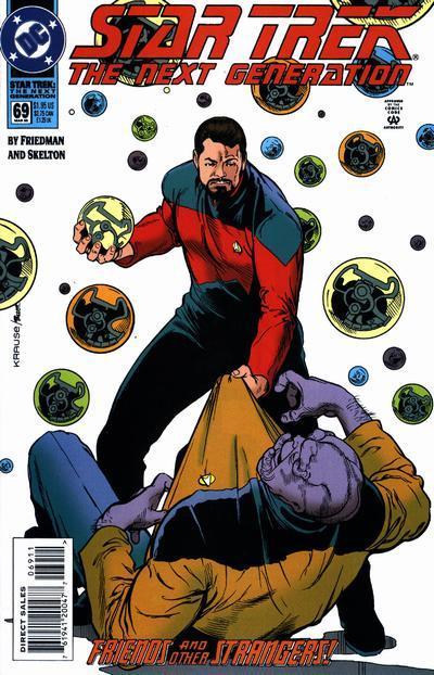
Heyo everybody! Jonny here. It’s no secret that here at High Five! we love us some BOOM! Studios. Recently I was given the opportunity to interview artist/writer Peter Krause whose work includes pencils for Irredeemable, The Power of Shazam!, and sundry 90s Star Trek comics. Published below is my Q&A session with Mr. Krause, conducted via emails and interwebs:
————-begin————
High Five! Comics: Thanks again for the interview. We always have fun interacting with industry people and getting human faces/personalities for the books we enjoy reading every month. When did you start reading comics?
Peter Krause: Somewhere around 9-10 years old. We had a drugstore around the corner from where I grew up in south Minneapolis, and comics were stocked on a spinner rack there. That’s what I spent my allowance money on–comics. I always bought Superman or World’s Finest. My brother bought Legion of Superheroes and Teen Titans. Later, I discovered Marvel comics. Spider-Man and Daredevil became my new favorites.
HF!C: Some people grow up knowing exactly what they want to do, and most of us stumble in to a job that works for us. Where on this spectrum did comic illustration fall for you? Was it something you dreamed of doing as a kid, or something you fell into?
PK: Oh yeah, I dreamed of it. In grade school, I became good friends with two other guys who also drew all the time. We’d hang out at each others’ houses after school, draw and trade comics. But drawing comics for a living remained a dream. My parents always encouraged my drawing, but somehow I didn’t ever think I’d make a living with my art. I graduated from the University of Minnesota with a BA in studio arts and also a degree in journalism. My first freelance job after school was a writing gig. It wasn’t until Lisa and I got married that I reconnected with my love of drawing comics. After several years of working with smaller companies–including a self-publishing stint–I got my first freelance assignment with DC.
HF!C: You’ve been in the business long enough to have been influenced by some of the Silver and Bronze Age artists. What can you tell us about your influences (inside, and outside of comics), and what artists have been most important to you?
PK: The most obvious influence is Curt Swan. I was a Superman fan–first and foremost. Curt drew the Superman I grew up with. When I was showing samples at conventions, Curt Swan’s name was brought up in comparison. Not that I was as good as Curt, mind you. But the influence was there. Curt was a Minnesota guy, like me, so maybe there was something in the water! Other favorites from my childhood were Jack Kirby, John Romita Sr., Gene Colan, Gil Kane, Nick Cardy, Carmine Infantino, John Buscema. And of course, Steranko. Steranko just completely blew our minds! We’d never seen anything like his stuff before!
HF!C: Do you have an artistic philosophy?
PK: Always make your present assignment a bit better than the last. And don’t be afraid to fail–failure leads to learning.
HF!C: When I read your 90s work I notice a stark (and pleasing) contrast from the exaggerated, often abrasive imagery that was so popular at that time. Did you feel any pressure then to mimic that style?
PK: Ultimately, I think you draw the way you have to draw. Not that you can’t learn from others, but I was attracted more to the solid, Alex Raymond approach to storytelling. I remember Frank Miller saying that chasing trends is a fool’s errand. That can apply to your art as well.
HF!C: Were there any offers between “Power of Shazam” and “Irredeemable” that you turned down?
PK: I did turn down some things, but it wasn’t like comic editors were beating down my doors. I’m not sure that “Power of Shazam!” was seen as a success at DC–Jerry Ordway has commented on that in his Modern Masters book. I did get a few smaller assignments from DC–I’m sure that was Mike Carlin’s doing. But I was getting some interest from local ad agencies and production houses to do storyboards and marker comps, so I turned my attention to that line of work.
HF!C: “Irredeemable” is a year old now. How has the critical and commercial success of the work impacted you or your career?
PK: I can easily say that the last 15-16 months have been the busiest of my drawing career. I still do some storyboard work–the pay is just too good. When you put a monthly book on top of that, it makes for many hours at the drawing table. The Eisner nominations–“Best New Series” and “Best Continuing Series”–were a bit of a shock. What impact that has on my career is too early to say. But Mark Waid has been very supportive, and my editor Matt Gagnon has worked around the rest of my drawing assignments. And since I’m giving out kudos, Andrew Dalhouse’s colors have been great.
HF!C: “Irredeemable” has given you a unique opportunity to create characters from scratch. How much of yourself is in these characters?
PK: When we started working on “Irredeemable”, Mark gave me a rough outline of the characters we needed to design. I actually followed up with some more written details on each of the characters as I saw them. I’d hate to say that there are aspects of my personality in each of them–that’s what our imaginations are for. But we have striven to make the characters human with real flaws–some of which have had fatal consequences. And some of the characters I identify with more closely than others.
HF!C: Do you have a favorite character, and is it because you love or hate that character?
PK: Qubit and Kaidan are my favorites. Qubit because he’s a bit obsessive and kind of a straight-line thinker–I’m a bit too much like that myself. Qubit is the closest character we have to Reed Richards–but perhaps without the moral certitude Reed has. Reed Richards has always been one of my favorite comics characters. Kaidan appeals to me because she likes being part of a team, and also is a bit unsure of her worth. She’s at heart an optimist, and maybe a bit naive. All those things make it easy to root for her. And as you will see in one of the upcoming issues, she discovers another aspect of her powers. I think Mark has big plans for her.
HF!C: In issue #9 of “Irredeemable” we saw a good deal of role reversal. Tony seemed fragile and human, whereas The Paradigm became much darker and almost sinister. Has your perception of the characters changed as this project moved forward, or have you and Mr. Waid maintained a consistent vision?
PK: I think the Paradigm/Plutonian conflict has not been inconsistent, but it has brought out hidden aspects of the heroes’ personalities. I think the Paradigm is wrestling with the “ends and means” dilemma, and that’s pushing them to a place where they are a bit unsure. But that’s a place where we can tell a lot of cool stories.
HF!C: Before we go, is there anything you’d like to plug, promote, or otherwise talk about?
PK: I’m on a bit of hiatus, as my next issue of “Irredeemable” will be #16. The incredible Diego Barreto will be drawing issues #13-15. I’d just like to thank everyone for supporting the book. If you haven’t read it, please give “Irredeemable” a try!
————-end————
Congrats to Peter Krause, Mark Waid, and the rest of the creative team/staff at BOOM! Studios for their much deserved Eisner nomination. Irredeemable #13 is in stores now (sadly lacking Krause’s art, yet pleasantly featuring fine pencils by Diego Barreto). Many thanks to Peter Krause for taking time out of his schedule to mingle with us internet nerds.
Happy readings!
-Jonny
 Cartoonist Shannon Wheeler made a name for himself after years of penning the misadventures of not-quite-superhero Too Much Coffee Man, one of the most oddest, funniest and occasionally heartbreaking alternative comic strips of the 1990s . After a long run on the overly-caffeinated, existentially tormented hero in the long red pajamas that includes hundreds of strips, a number of collections and a two act opera, Wheeler has moved on to greener cartooning pastures, providing cartoons to the hallowed halls of The New Yorker. This month sees the release of The Too Much Coffee Man Omnibus by Dark Horse Comics, representing the sum total of Wheeler’s work on the strip. I got a chance to talk with him briefly about opera, television, beginnings, endings and the travails of life on the college paper.
Ian Chant: The Too Much Coffee Man Omnibus comes out later this month, collecting all Too Much Coffee Man comics, from anyplace ever. Anytime I see any omnibus of anything come out, I can’t help but think about something Bill Watterson wrote in the foreword to the big Calvin and Hobbes collection that came out, to the effect of how weird it is to see the length and breadth of a series in a box essentially. Is there something jarring about that?
Shannon Wheeler: There is, I think that’s what causing me some of the mental problems in dealing with it. I mean, just looking at this thing and just going ‘Well, I put ten years of effort and sacrifice to make this.’ Was it really worth it is what you really have to face up against. And of course there’s no answer, and you alternate between feeling a lot of pride and a lot of shame, and ultimately you get to ‘Well, this is what it is and this is what I’ve done’ and you move forward. But it’s a lot of emotions to deal with, definitely.
IC: To you, is Too Much Coffee Man a comic strip, or a weird superhero story, or something else altogether?
SW: I don’t know. I thought it was going to be something that would last one strip. I thought this would be one gag, and I did it sort of as a play. It was just a one off. And then I turned in some ads for a book store, and I thought ‘I can do a comic strip that’s an advertisement.’ So I did a little ad for them, and then I was like, oh, I’ll just do another one, and I’ll do a second issue of the mini comic, and I just kept coming up with stories that seemed to suit the way I thought about things. It became a lot more personal than I thought it would be, too, and it became very autobiographical in an sort of an existential way. A lot of my stuff was always autobiographical, but emotionally I found I could express these thoughts and fears, and it was just so efficient and convenient I just kept having ideas, and I thought ‘If this is my inspiration, why fight it, why do something more artsy… if what I want to do is write Too Much Coffee Man stories. I don’t know, it made me happy.
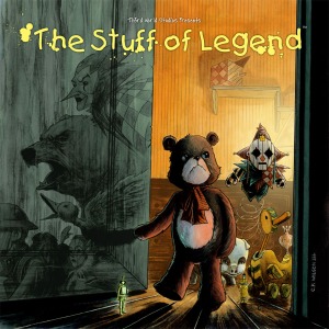
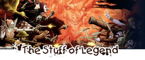
We first discovered The Stuff of Legend back in August and gave it a glowing review. Last month, we chatted with Charles P. Wilson III, the talented man behind the book’s amazing art. And now, to kick off a return to post-con regular posting, we bring you our interview with Mike Raicht, who co-writes The Stuff of Legend along with Brian Smith.
Thank you for taking the time to answer some questions for us! (And congratulations on selling out the first printing, by the way.)
No problem. And thanks for taking the time to speak with me. It’s been a very exciting time for us on The Stuff of Legend. Everyone from Jon and Mike D. at Th3rd World Studios, to Brian, Charles and I, really put our hearts into it. The first issue selling out was a complete thrill and we’re happy people like yourself have really been supporting it and us. We hope we can keep bringing people on board.
Happy to help! First off, I read your interview with Liam Bradley; I noticed that you’ve got a plan to get out of your house in case of a zombie attack. If you need somewhere to hide afterward, I’ve always planned to hole up in a Costco (or better yet, a Sam’s Club – they have guns). Food for years, household goods, generators, pretty much no windows at all, block those front doors and you’re home free until the zombiepocalypse is over. As someone who’s written a fair amount of horror, do you think that’s a safe bet?
I’d be nervous that, just like a mall, a Costco might be a zombie magnet. Romero zombies especially seem to have a need to go where they’ve been before and lots of people have been to Costco. Maybe even more than malls now. Unfortunately, the real unspoken golden rule of the zombie apocalypse is to be aware and cautious about the company you keep. It’s the dopey alive humans that always seem to burn you in the end. You may have all that stuff but you have to make sure the people in your Costco aren’t going to end up getting you killed or getting you infected. It’s quite a complicated scenario.
After writing Army of Darkness and a few zombie books, it was inevitable that The Stuff of Legend might find itself peppered with traces of horror. The Stuff of Legend originally started out as a somewhat more family friendly piece, obviously there’s a scene with the Colonel that took the book to a much darker place – to say nothing of Percy’s dilemma when you consider that in The Dark he’s a Real Pig. At what point did you realize this book was skewing older, so to speak, and how has that affected the direction the book is taking now?
It was only family friendly in that when I approached Brian Smith with the initial idea, which has morphed quite a bit, I originally wanted to create something my son, Austin, would enjoy.
The way I look at it is, I was into X-Men comics by the time I was 8 and if it had puppets or was a cartoon, my dad took me to see it in the theater. The Secret of Nimh, Watership Down and The Dark Crystal were all pretty intense back in the day. I was scared but it was an awesome scared. So in the end, I think this is a kids’ story because kids want to read cool and intense things. It’s just in the way that it is presented that can push it over the top.
I think that, when we got going on the story, we wanted to do something kids and parents would enjoy and experience together. We still do think this is something kids will enjoy and while we are aware we shouldn’t push things too far, we do want to tell the story as it should be told. Sometimes it will be a little scary and there will be tragic moments, I hope parents are involved enough with their kids to make sure it’s something they can handle.
The Stuff of Legend might help start Family Comic Night! (Take that, Monopoly.) This is really a book for parents to read with their kids then – especially the younger ones?
I’d probably say really young kids would not be the audience on this book. Every parent needs to kind of make that call themselves. My son is 3 and I would never dream of really telling him what’s up with certain scenes. He is drawn to the art but that’s because Charles is a twisted, evil genius who makes nice cute little itty bitty animal things that eventually transform into something wicked. It’s a demented gift.
The art in this book is some of the most gorgeous I’ve seen. What was it like the first time you got sketches back from Charles?
Seeing Charles’ art for the first time was amazing. It was clear he completely got it and was going to take our script and make it way bigger than anything we could have imagined it being. It’s an awesome feeling when you find the perfect artist.
We were extremely lucky that Mike Devito brought Charles on board. He was a graduate of the Kubert School and was there when Mike’s brother was going to school there. This project wouldn’t be close to what it is now without Charles.
The toys-coming-to-life convention is not a new one. There’s Steadfast Tin Soldier, Indian in the Cupboard, Toy Story – the list goes on. They all feature the beloved toy heroes with little if any focus on the shabby old ones cast off by their owners. Any plans to go in-depth with the rejected toys that have gone over to the Boogeyman?
The second chapter focuses on a few of the villains and we get to know them quite a bit better. We definitely believe developing the villains is just as important as the heroes, otherwise the conflict just isn’t as compelling. However, a lot of the characters in this book, good and evil, will have their beliefs and roles challenged, making them evolve into much different places than they are now. At least we hope so.
So we’ll see or learn about the origins of some of the Boogeyman’s army, stories of their lives back when the Boy played with them? Are you hoping to build a much wider universe within The Stuff of Legend?
Right now, most of the Before… scenes are planned to focus on those toys in our band fighting to save the boy. We’re playing with doing some different things in the next volume, The Jungle, coming in Spring 2010. We have a lot of plans for the Stuff of Legend universe we just hope we can get to them all. Brian (my co-writer) has some amazing ideas on different places our characters can visit and who they will meet when they get there. Both of us are just really excited the book did well enough to continue. The best thing about all of it is that Charles will be drawing it. He brings so much to the book.
You were a huge X-Men fan as a kid (yes, we did some light internet stalking.) Do you ever find yourself applying the classic superhero team dynamic to our toy heroes?
The mutant books were hugely influential in my life as a kid. Of course that was back when only Uncanny X-Men and New Mutants existed. The staple of those books was the interpersonal drama going on between these amazing characters. So, I think since that is my background, I definitely brought some of those team dynamics into what we’re doing. The relationships between all of our characters are the cornerstone of this book and will drive most everything in it for a long time to come.
I have to ask this. What was your favorite childhood toy?
That’s a good one. I loved Star Wars toys. But they were kind of a cheat, compared to the old time toys, imagination-wise because they came with a personality built in. My mom and I used to go down to Fey’s Drug Store every Tuesday to go through the new shipment. I was only like 4 or 5 years old. Unfortunately, I always let people borrow them and they’re all gone now. Those are the toys I miss the most and wish I could have passed on to Austin, so they must have been my favorites.
You’ve got a great point there about modern toys being “cheats.” One of the greatest concepts in The Stuff of Legend is that the toys’ personalities all stem from what the boy imprinted on them during playtime; are we going to see those personalities change at all now that the toys are ‘real’?
I’d hate to give too much away! Some people thrive under pressure while others wither. How each toy is ultimately effected remains to be seen.
Darn! You saw right through my clever attempt to get some spoilers, but Book Two is out this month, right? What’s the release date?
Yes, the book hits this month. Right now it looks like the book will be hitting on October 21st. It’s been sent to the printer so it is in their hands. It is 56 pages of amazing art, in a very cool Th3rd World Studios package for the amazing price of $4.99. Not bad.
***
Not bad at all! If you haven’t yet, go check out the first issue, the second printing should still be available in stores! If you’re on the east coast and headed to Baltimore Comic-Con this weekend, swing by the Th3rd World Studios booth (1904) and pick up the convention exclusive variant. And send it to me.
High Five! gets a lot of traffic from casual comics fans; I know because my mom comments on every third entry. While most fans are surely aware of the issue I’m about to riff on, the less initiated may not be:
You love Todd Klein. You may not know it, but you do.
Did you like The Sandman? What about Fables? The Dark Knight Strikes Again? The Invisibles? Kingdom Come? Promethea?
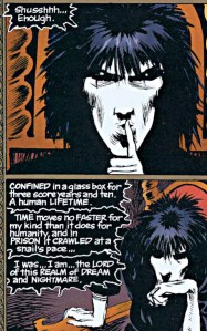 Todd Klein lettered all of them. Neil Gaiman may have given Morpheus his words, but with those now-iconic wavy black speech bubbles, Klein gave the Sandman a VOICE. He’s been in the comics business since 1977, back when penciling, inking, lettering – everything – was still done by hand. In the late eighties and early nineties when the comic production process became more & more computer based, a lot of letterers cried foul and refused to work digitally. Most of them aren’t working now. Todd Klein, on the other hand, made hundreds of font sets based on his lettering styles and wholeheartedly embraced the new technology. He is one of the the most sought after letterers in the business – and after you’ve read enough comics – one of the most recognizable.
In the assembly line that is modern comics production (writer, penciller, inker, letterer, and somewhere in there, an editor gets involved), the letterer is by far the most unsung member of the creative team. A letterer doesn’t just scribble some words into pre-drawn speech balloons (though I’m sure it happens that way sometimes); the letterer lays out the speech & thought balloons in a logical manner – and in a wordy, complex comic by a writer like Alan Moore or Neil Gaiman, presenting the dialogue and inner monologue in an intuitive progression is no small feat.
Not just bubble placers & fillers, letterers usually design and place sound effects too. Sound effects in comics are odd, you don’t necessarily notice them unless they’re crappy or just not there at all. But where would Wolverine be without “SNIKT!”? Where would Spidey be without “THWIP!”? And where would ‘SNIKT!’ and ‘THWIP!’ be without good letterers? It can be easy to get wrapped up in the story and the “oh sh*t!” moments and miss the fact that you’re not just reading a book, you’re looking at a piece of artwork – and I don’t mean just the pretty pit-chers. Lettering gives characters a voice, bubble design and placement paces the story, sound effects set the mood, and all of this is done by the guy you probably forgot about.
But we didn’t! In fact, we conducted a little Q & A with Mr. Klein, who was kind enough to take time out of what must be a pretty busy schedule to answer our questions.
High Five!: We all know that you started out “in the pit,” as it were, at DC in the late seventies. Could you talk a little about your comics career before you landed the DC gig?
Todd Klein: Well, that’s pretty easy: I had none! I was a long-time comics reader and fan, had spent two years in art school, but was never good at drawing people, which is kind of a prerequisite for becoming a comics artist. I did prepare a sample story when I applied for the job at DC, you can see the first page here, but the best thing about it was the lettering, which I always had an interest in, though that was my first attempt at comics lettering.
High Five!: After doing your time on the assembly line at DC, you went freelance. You’ve worked with all the top names in the industry. Was there ever a moment that you felt overwhelmed or more intensely challenged than usual by a project?
TK: I can’t say I ever felt overwhelmed, and I enjoy challenges. Some projects are more challenging than others, certainly. Working on “Starstruck” with Michael W. Kaluta and Elaine Lee early in my career was the first time I was asked to do lots of different lettering styles, and that paved the way for what I did on “Sandman,” but it was all fun. Some assignments end up taking much too long, and one tries to learn from that. On the other hand, some go quicker than expected, so it evens out in the long run.
High Five!: When lettering went digital, you were one of the first to embrace the concept of computer lettering. You’ve covered a lot of the finers points of the subject on your very extensive website. Do you feel that lettering “loses something” when it is digitally rendered?
TK: There are many differences between the processes of hand-lettering and computer-lettering, both have their good and bad points, both can be done well or poorly. I do sometimes miss the physical process of hand-lettering, but then when I get the occasional assignment to do that way, I struggle because I’m out of practice, and it takes way too long!
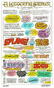 High Five!: Beautifully drawn words paired with beautiful artwork is far from a new concept. I honestly believe there’s a possibility that centuries from now, scholars will look at certain comics the same way we might look at medieval calligraphy and illumination today – do you feel there’s a connecting thread between the two?
TK: I certainly felt one when I did hand-lettering. Typewriters replaced practitioners of fine writing in the business world decades earlier, but there were always artists and craftsmen needed for signs and decorative text of one sort or another, and there still are, even though much of that need is now filled by computer fonts. You can find artistic and decorative hand-lettering out there if you look for it, though.
High Five!: Sound effects are an often overlooked aspect of an overlooked art. Who has the biggest influence on sound effect design & placement, or does it vary from project to project?
TK: My approach is usually to try to match the style of the art if I can. Gaspar Saladino was great at that, and I always looked to him for inspiration. Sometimes editors or artists have particular styles they prefer or don’t like, so that’s a factor. And working on the computer, I have a set of my own sound effects fonts I turn to most of the time, and a few other commercial fonts I also like.
High Five!: You’ve mentioned Gaspar Saladino as a major influence more than once, what other letterers would you recommend taking a look at?
TK: For hand-lettering: Tom Orzechowski and Dave Sim come immediately to mind, lots of others worth looking at, but if I try to list them all I’ll leave someone out. For computer-lettering, I look at font creators rather than letterers using the fonts created by them, and John Gaushell of Comicraft, Nate Piekos of Blambot, and Rian Hughes are all doing fine work.
High Five!: You worked with JH Williams III previously on “Promethea,” and you’re working with him again on “Batwoman.” Obviously, working with Rucka is a very different experience than working with Moore – how has your previous work with Williams influenced the book?
TK: When I work with JH, it almost doesn’t matter who the writer is, I’m working with JH, and he and I are in close contact. He lets me know what he wants, and I try to give it to him (or tell him it’s impossible occasionally). Jim has very specific ideas about everything that goes on his pages. Dave Stewart (the colorist on Batwoman) and I are along for the ride, and trying to keep up!
Thanks again to Mr. Klein for taking the time to answer some questions for us. Check out kleinletters.com; the site is chock full of in-depth lettering information as well as cool stories from Todd’s 30+ years in the comics industry. Be sure to check out the blog as well, it includes some fascinating logo studies. Mr. Klein has also created some awesome limited edition samplers, working with the likes of Alan Moore, Neil Gaiman, JH Williams III, and Alex Ross – the samplers are signed, hand numbered, and at $20 a pop, a totally affordable piece of awesome.
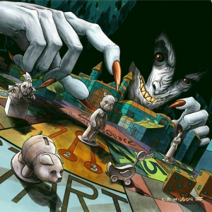
A few weeks ago, we picked up The Stuff of Legend on a whim. To our delight, this outstanding book has become a surprise hit; with many shops selling completely out of Issue #1, “The Dark”. Mike Raicht and Brian Smith have crafted a truly haunting original story that turns the toys-coming-to-life theme completely on its ear – and the artwork is striking to say the least. We recently conducted a little Q&A with the artist, Charles P. Wilson III, on The Stuff of Legend, comics in general, and high five etiquette.
High Five!: My favorite real-live version of the toys from Stuff of Legend is the Jack-in-the-Box. He honestly looks kind of psycho. How did you go about character design as far as translating the toys to “real life?”
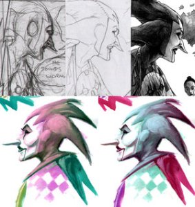 Charles P. Wilson III : Jester’s one of my favorites too. Mike Raicht and Brian Smith did a great job putting together a well rounded ensemble cast of characters in the story. Each one has a unique role to play with a level of depth to each of their personalities, developed when they were toys in the kid’s bedroom. They carry those personalities into The Dark, the realm created by the Boogeyman, and while the transition may be beneficial to some, it has disastrous consequences for others.
As far as character design, each of the characters were based on toys that had to exist in or before 1944, when the story takes place. A lot of toys back then were made from materials like lead, wood and cloth with little-to-no articulation, so the toys were relatively simplistic in design. A lot of the real-life counterparts, or Dark versions, of the toys were drawn up first and then translated to toy form, like the Jester. I tried to give most of the characters some kind of pattern unique to their look so the reader could make a definite connection between the toy versions and the Dark versions.
High Five!: So what was your favorite childhood toy? And were you the sort of kid who imagined your toys probably came to life while you were gone? What adventures did you think they got up to?
Charles P. Wilson III : Absolute favorite? Before Transformers, G.I. Joe and Star Wars I had a white stuffed bear that looked kinda like the Snuggle bear, and is sort of the basis for Maxwell. From what I can remember, it had a bow, although I can’t remember the color (pretty sure I took it off at some  point), and the bear was pretty dirty most of the time due to its color. My brother got a black, bean bag kind of bear at the same time, and I think I remember that was more fun to play with, but I had the bear for a very long time. I don’t remember thinking my toys had any kind of life to them outside the times I played with them, but after seeing Poltergeist (I think it was a clown doll) I didn’t look at inanimate toys the same way again. Same thing with my early phobia of the ocean after seeing Jaws.
High Five!: The Stuff of Legend is your first published gig, correct? What’s it like to find yourself on the other side of the table?
Charles P. Wilson III : This book is my first published gig where I had the luxury of drawing all the interiors and painting up the covers, and Mike Devito and Jon Conkling did an outstanding job putting it together and designing everything around the artwork. Every now and then I like to pick up my copy and imagine what it must be like for a complete stranger to look at and read it for the first time, what they might think of it. Reading through the reviews and seeing initial reactions to the book has been fantastic, and I’m grateful so many people gave the book a shot.
High Five!: It’s a great book! If you were given the chance to draw any cape & tights book right now, who would you draw? And who would you want writing it?
Charles P. Wilson III : Tough to say. The first book I ever picked up was a Superman book, so it would feel right getting a chance to work on one of those as my first superhero gig, but I’d love to tackle a book with Batman or Spider-Man villains, or maybe even The Hulk, and I’d like to keep working with Raicht and Smitty – if they could dream up the stuff behind The Stuff of Legend who wouldn’t want to work on whatever they create for any cape and tights title?
High Five!: So what’s your favorite comic out right now? And what do you recommend drinking with it?
Charles P. Wilson III : Right now I’m heavily in favor of The Walking Dead. Still trying to catch up (I think I’m on issue 60) but it’s immensely satisfying. It manages to pull off what a lot of the zombie flicks haven’t been able to do for me completely, something that I’ve always been interested in, and that’s what the characters do next with pacing that doesn’t make me feel rushed. I think comics are the appropriate medium to pull that off, with TV not far behind it (and wouldn’t you know it, The Walking Dead is going television!). And with this book I’d say a nice, light beer, kick your feet up and let the story pull you in.
High Five!: And finally, if a complete stranger walks up to you with an arm extended aloft for a high five, do you enthusiastically return the gesture or get creeped out?
Charles P. Wilson III: I’d gladly return the gesture! Might have reservations if there are obvious hygiene issues, but I highly encourage any positive greetings if the two people will have a better day for it, and what epitomizes that more than the high five?
Pretty much nothing, if you ask us. Thanks to Charles for chatting with us! Y’all should check out his deviantArt page (pretties!), and follow him on Twitter. And if you’re not reading Th3rd World Studios’ The Stuff of Legend yet (read our review!), the second printing of issue #1 should hit stores this week. Pick it up and add it to your pull lists!
